
Graphic & Visual Design
This project encompasses four key graphic design and operational communication interventions developed for Tamarit Beach Resort. Due to a high workload within the central marketing department, these design requests were managed directly from the Sport Club department to accelerate turnaround times. The project covers the brand identity transition for the resort's owned bicycle fleet, safety and operational regulation updates for sports and inflatable areas, the creation and motion display adaptation of Virtual Reality promotional signage, and custom identification labels for the rental fleet.
Tamarit Beach Resort needed to adapt various physical and digital assets to align with operational and institutional changes:
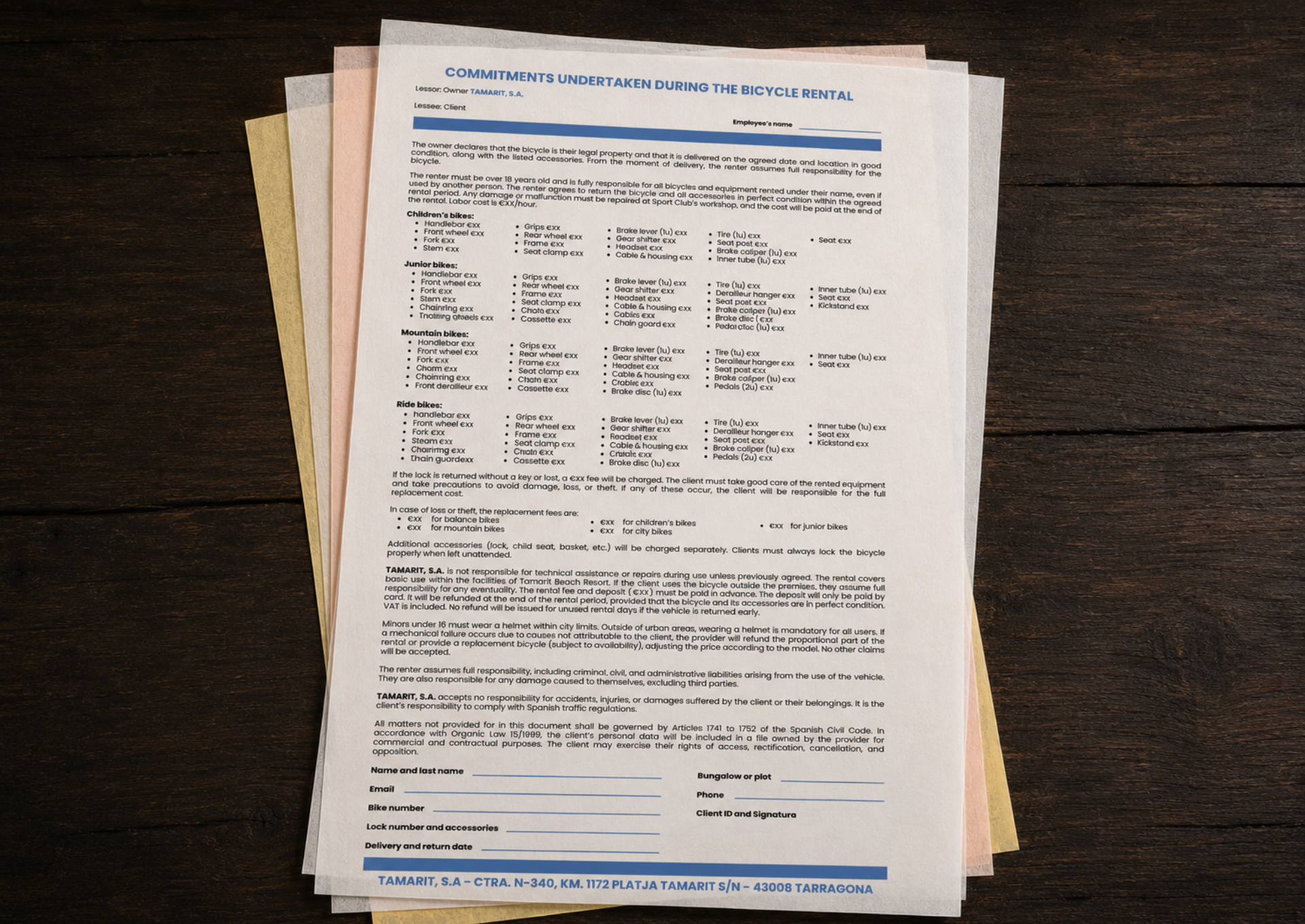
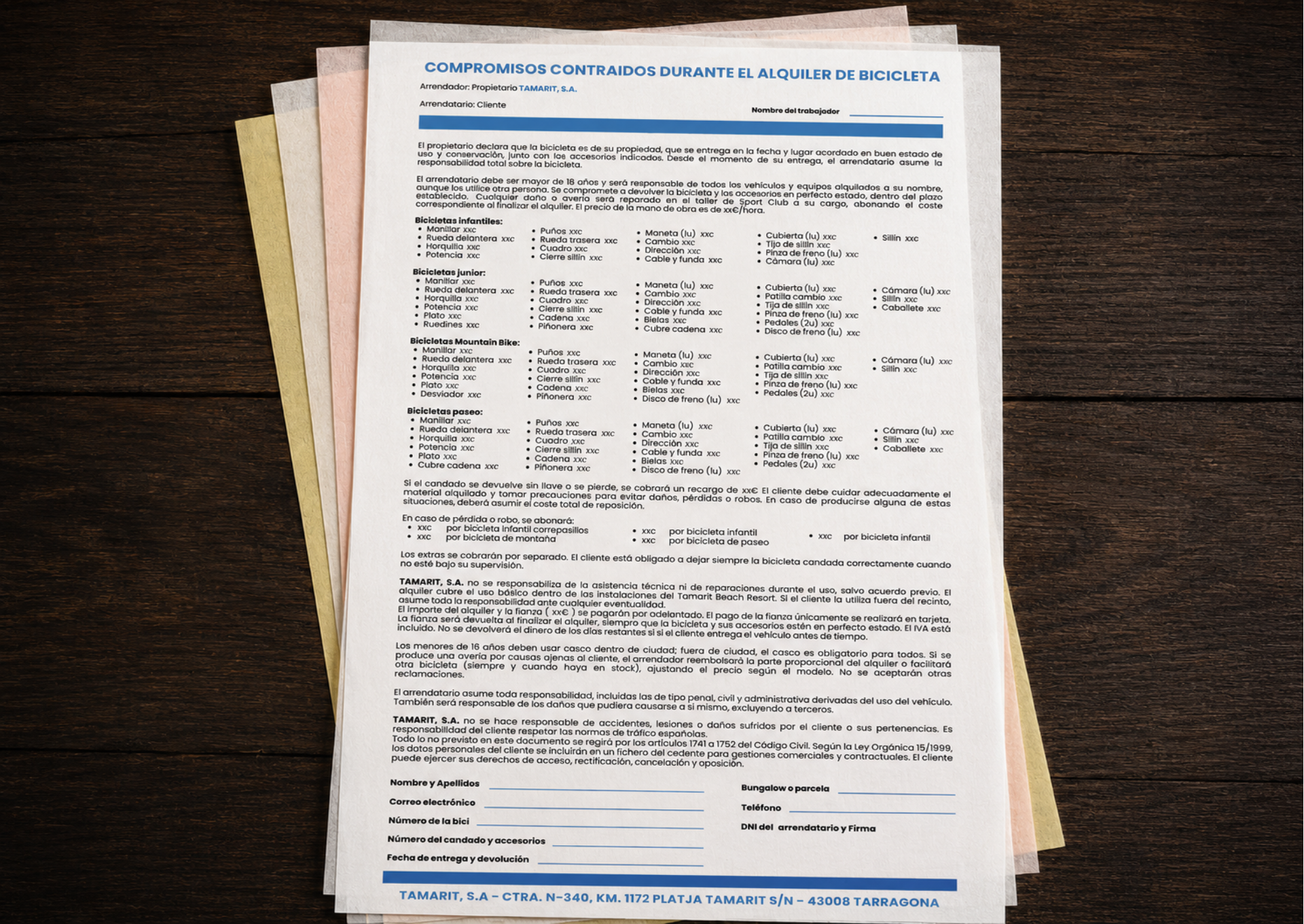
- Brand Transition & Data Collection: Acquiring the bicycle fleet required removing previous external supplier branding (Adventure Bike Rental) and implementing an in-house rental contract that maximized client data entry space while ensuring bilingual compliance.
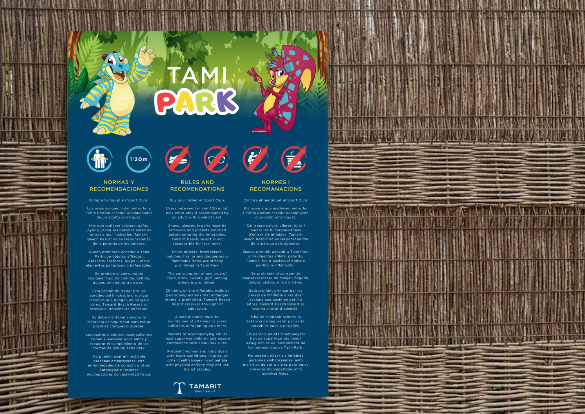
- Missing Digital Source Files: Updating the safety regulations sign for the sports inflatable park (Tami Park) required rebuilding the graphic layout completely from scratch, as vector source files were unavailable.
- Dynamic Content & Multi-Platform Delivery: Software platform shifts (Uplaan) and evolving leisure offerings (Virtual Reality) required static posters to be immediately updated and adapted into horizontal digital display screens.
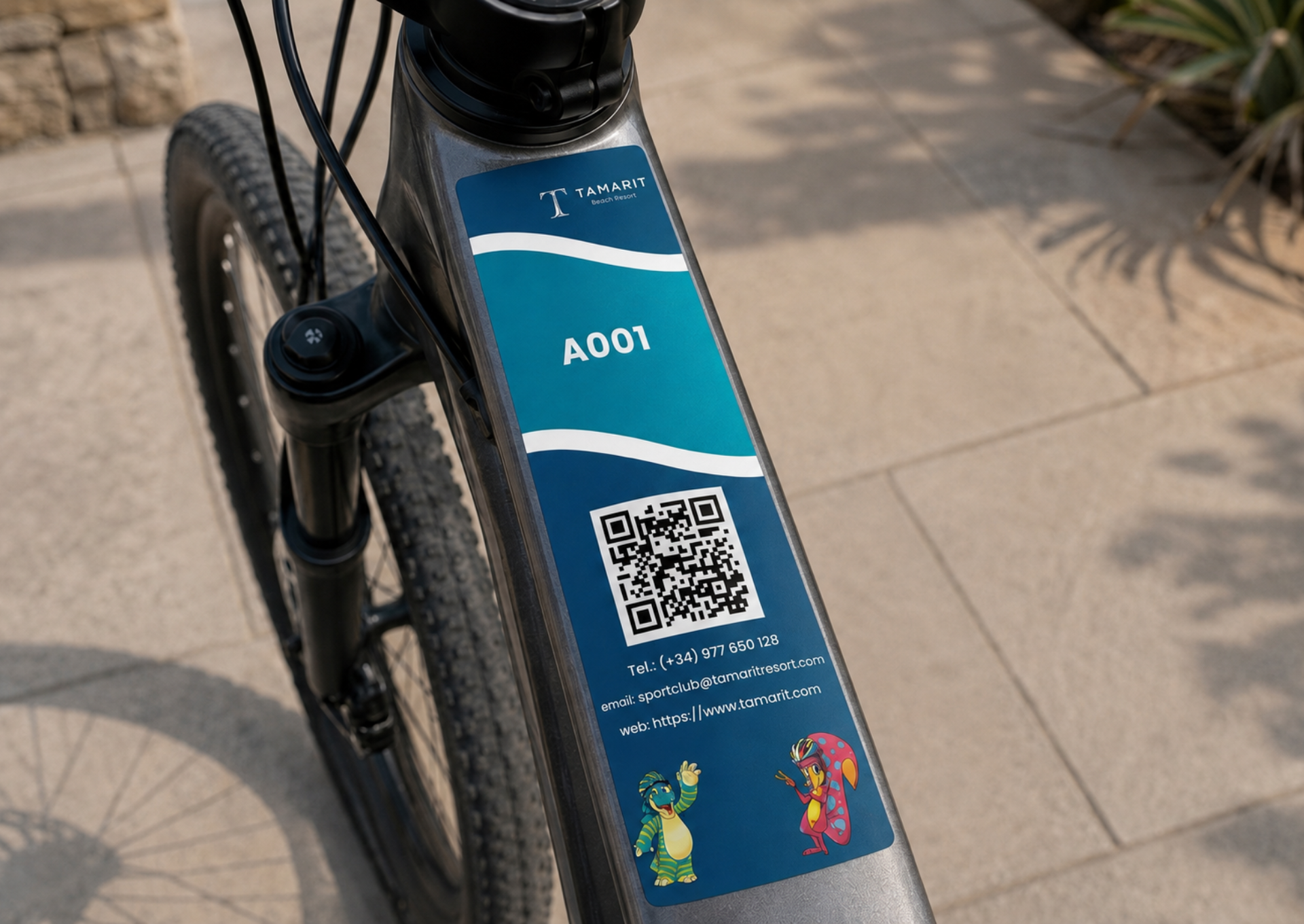
- Cohesive Fleet Branding: Designing durable, functional labels for the bicycle fleet that combined the resort's sophisticated corporate branding with friendly elements tailored for younger audiences.
To address technical requirements and uphold brand integrity, we implemented a structured asset-by-asset design strategy:
- Contract Layout & Optimization (Bicycle Fleet): Redesigned the legal agreement to include updated pricing structures and brand transition details. For the 2026 iteration, we restructured the lower layout to introduce designated, high-legibility fields for guest details (full name, email, phone number, bungalow/pitch number, etc.) in both Spanish and English.
- Signage Vectorization & Rule Unification (Tami Park): Rebuilt the original sign graphics vector-by-vector to preserve existing resort aesthetics. We updated the legal and safety content following the installation of the new Wipeout attraction, consolidating safety guidelines (minimum height of 1m, adult supervision rules, health/medical restrictions,required attire, etc.) into a single trilingual layout (Spanish, English, and Catalan).
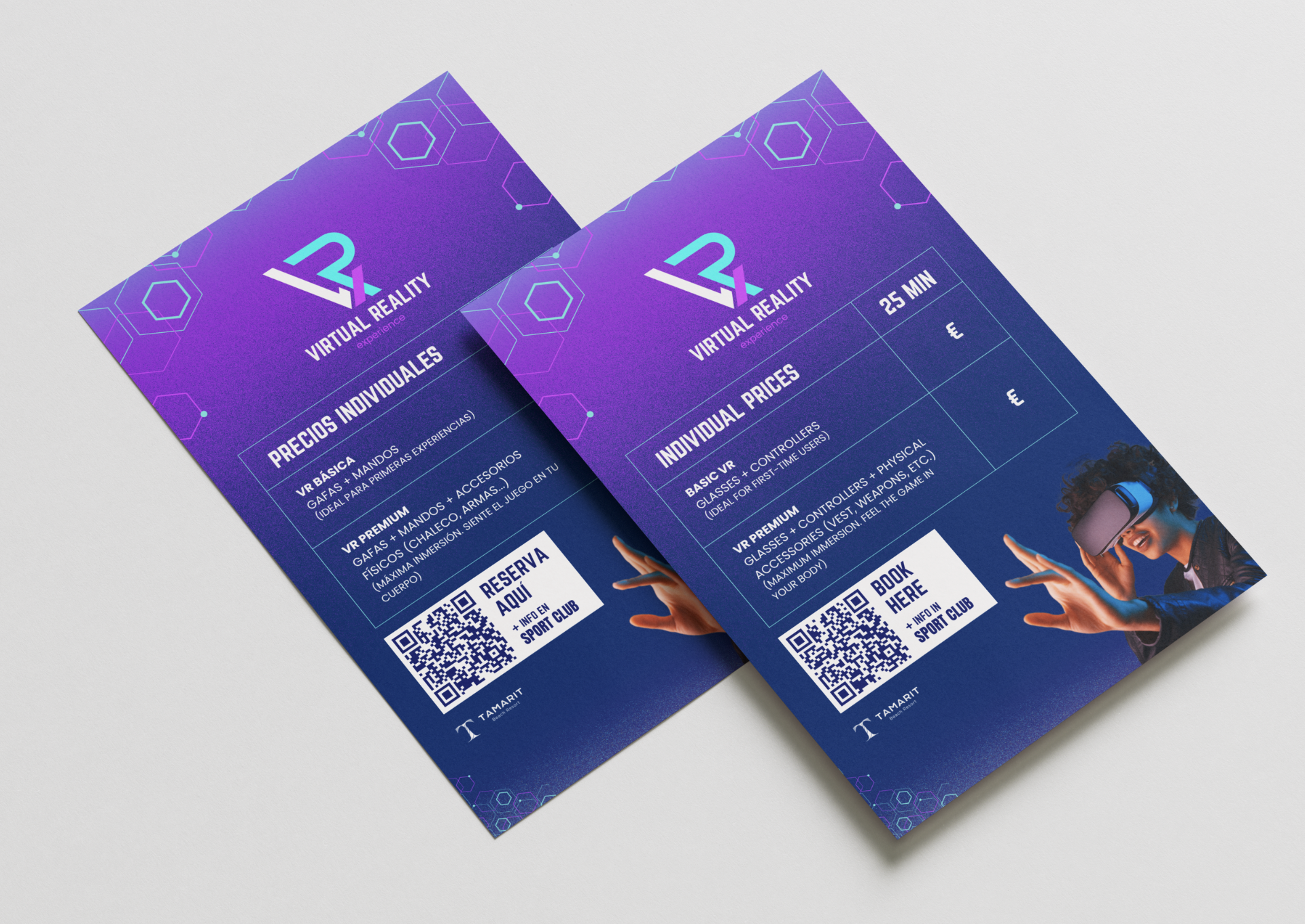
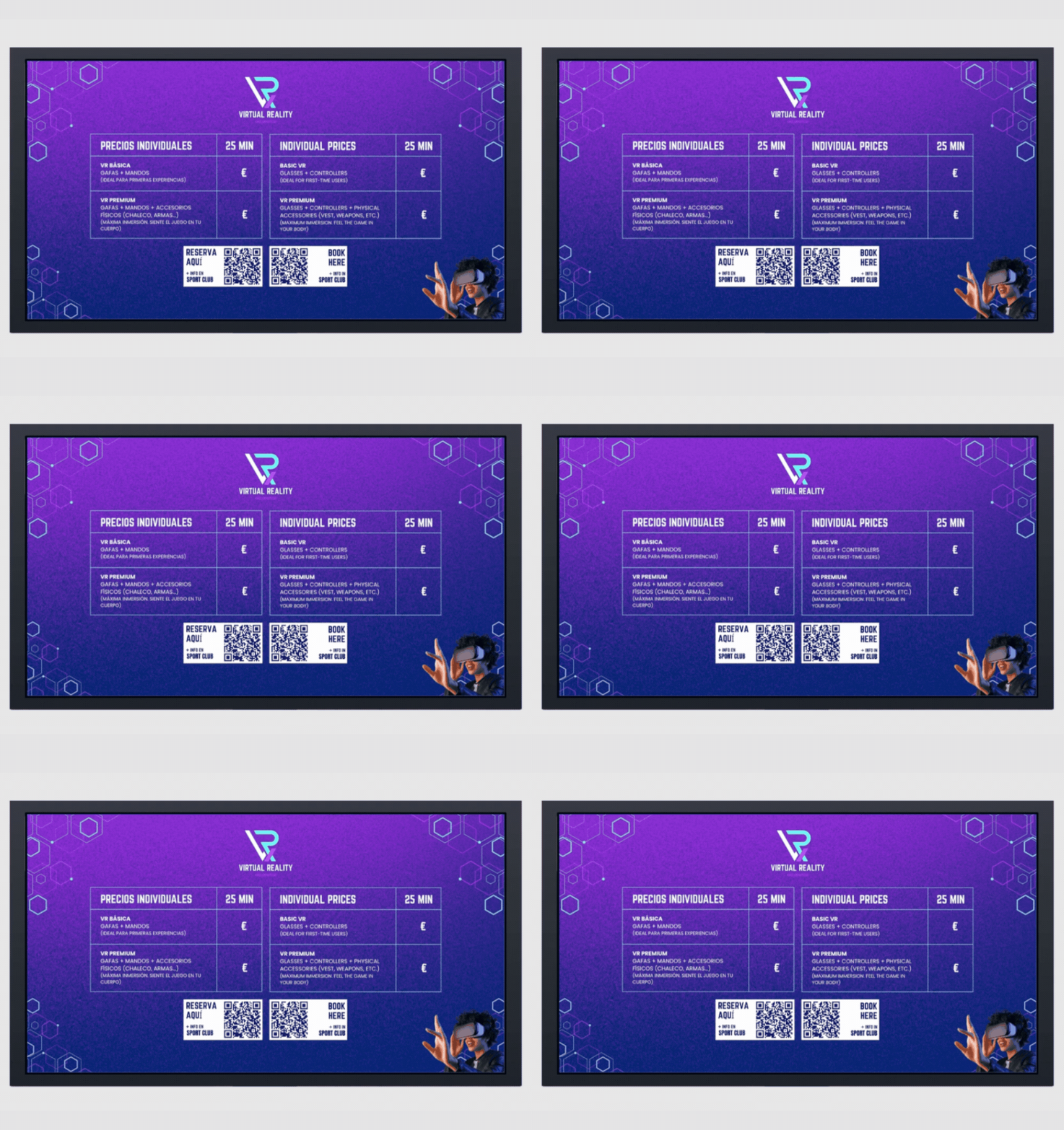
- Adaptive Poster & Motion Design (Virtual Reality): Updated promotional graphics by removing decommissioned activities and integrating the new reservation booking system QR code (Uplaan). We clearly structured game options by modality (VR Basic vs. VR Premium) and age guidelines, subsequently reformatting the static poster into a video piece for promotional TV displays.
- Fleet Label Identity System: Developed three distinct label concepts incorporating corporate colors (deep navy and cyan wave accents) as well as vibrant gradients for kids' bikes. The final selected concept seamlessly merged corporate wave elements, contact details, and a booking QR code, featuring resort mascots (Tami and Rita) wearing bicycle helmets at the base.
- Operational Efficiency: The revised contract layout drastically reduced check-in processing times at reception and eliminated illegible guest data caused by insufficient writing space.
- Legal Compliance & Accessibility: The unified trilingual signage for Tami Park provided clear safety directives for guests and staff, ensuring full regulatory compliance across the sports facility.
- Multi-Channel Versatility: Converting static graphics into videoenabled real-time guest engagement across high-traffic digital displays, driving direct conversions to the new booking platform.
- Unified Brand Identity: The rental bicycle fleet established a cohesive and professional brand presence, successfully balancing corporate sophistication with approachable mascot illustrations.
YEAR
2025-2026
SERVICES
Digital & Graphic Design
Brand & Fleet Identity
UX/UI & Print Layout
TOOLS & TECHNOLOGY
Canva Pro
Adobe Fresco
TAGS
Graphic Design
Brand Identity
Print & Digital Layout
Operational Design
Signage Design
Fleet Branding
Interested in a similar project?
Where design meets sound. A creative duo bringing your vision to life.
UX/UI Design
Editorial & Layout Design
Live Sound & Stage Setup
Music Production & Mixing
Online Marketing & Strategy
© 2026 Kore Studio. All rights reserved.